Introdution

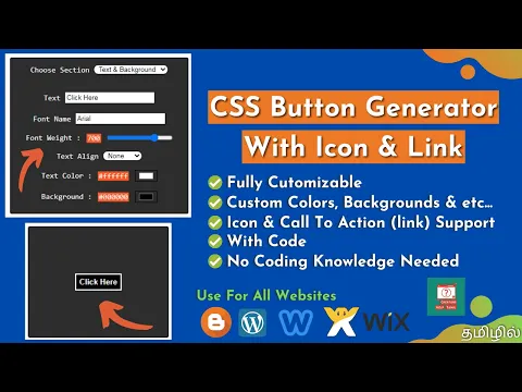
Hey Everyone !, Today in this post I made a CSS Button Generator (with Icon & Link) for you.
You can easily make a HTML & CSS Button With Icon & Link by using this generator.
So, Make Use Of this tool & let it be useful to all by share this post.
Features
- Full Customization Available
- Link Option Available
- Icon Option Available
- Full Code Provided & Free
- No Coding Knowledge Needed
The Generator
Documentation
Section 1 : Text & Background
This Section Contains,
- Text,
- Font Name,
- Font Weight,
- Text Align Position,
- Text Color And
- Background Color
Of The Button
Here, Its Reference
| Reference Table | |||
|---|---|---|---|
| Property Name | Default Value | Acceptable Values | Example Value |
| Text | Click Here | Any String | Click To Download (or) Click To Play etc... |
| Font Name | arial |
| - |
| Font Weight | 700 |
| - |
| Text Align Position | none |
| - |
| Text Color | #ffffff | Any HEX Value / Color Picker Value | - |
| Background Color | #000000 | Any HEX Value / Color Picker Value | - |
| " - " Indicates Any Acceptable Values | |||
Section 2 & 3 : Padding & Margin
This Sections Contains,
- Padding And Margin (Both Contains Top, Right, Bottom & Left Values Individually)
Of The Button
Here, Its Reference
| Reference Table | ||
|---|---|---|
| Property Name | Default Value | Acceptable Values |
| Padding Top | 5px | Any Value Selected By Range Selector |
| Padding Right | ||
| Padding Bottom | ||
| Padding Left | ||
| Margin Top | 5px | Any Value Selected By Range Selector |
| Margin Right | ||
| Margin Bottom | ||
| Margin Left | ||
Section 4 : Border
This Section Contains,
- Border,
- Border Style,
- Border Color And
- Border Radius
Of The Button
Here, Its Reference
| Reference Table | ||
|---|---|---|
| Property Name | Default Value | Acceptable Values |
| Border | 2px | Any Values Selected By Range Selector |
| Border Style | solid |
|
| Border Color | #ffffff | Any Value Picked By The Color Picker |
| Border Radius | 0px | Any Value Selected By Range Selector |
Section 5 : Hover
This Section Contains,
- Text Color And
- Background Color
Of The Button
These Styles Apply While Hover On The Button
And Here, Its Reference
| Reference Table | ||
|---|---|---|
| Property Name | Default Value | Acceptable Values |
| Text Color | #ffffff | Any Value Selected By The Color Picker |
| Background Color | #000000 | |
Section 6 : Open Link
This Section Contains, Link (href) Option For The Button
If You Want To Give Link For Your Button,
- First Check The Check Box,
- Enter Your Link In The Box Appear After You Checked The Box,
- When User Click On The Button, It Will Go To The Link You Given
- If You Don't Wan't The Link Option Please Unchecked The Check Box.
Section 7 : Choose Icon
This Section Contains,
- Choose Icon
- Icon Color
- Icon Color (On Hover) And
- Icon Margin Left & Right
For The Button
Here, Its Reference
| Reference Table | ||
|---|---|---|
| Property Name | Default Value | Acceptable Values |
| Choose Icon | None |
|
| Icon Color | #ffffff | Any Values Selected By The Color Picker |
| Icon Color (On Hover) | ||
| Icon Margin Left | 5px | Any Values Selected By The Range Selector |
| Icon Margin Right | ||
Note: This Generator Uses FontAwesome v4.7.0 For Icons (Only If You Select Any Icon)
See you again in an another useful post like this, until then Learn From The Learners....
